Tuesday, September 20, 2011
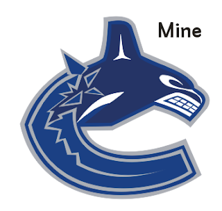
Canucks Logo
This is the Canucks logo assignment. The object of it was the create an almost identical logo by creating your own lines and shapes. I found this assignment very interesting and I was proud of my final image. The hardest part was doing the teeth because of the curve/line combination that can make it look good or not.
Subscribe to:
Post Comments (Atom)


No comments:
Post a Comment